HOLLAND
microsite
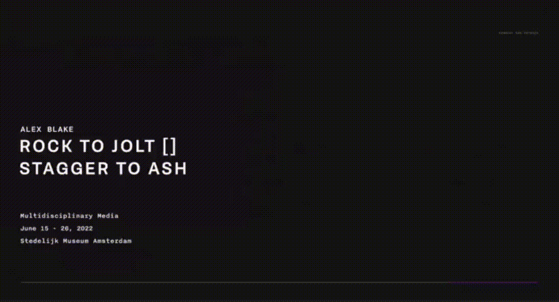
School Case Study
FESTIVAL
ROLES.
prototyping, art direction
interaction design
research, copywriting
DURATION. GROUP.
7 weeks, group project
Emma , Yuki, eunice, Stephanie
DELIVERABLES.
Poster collection to base art direction to translate to hi-fi prototyped microsite

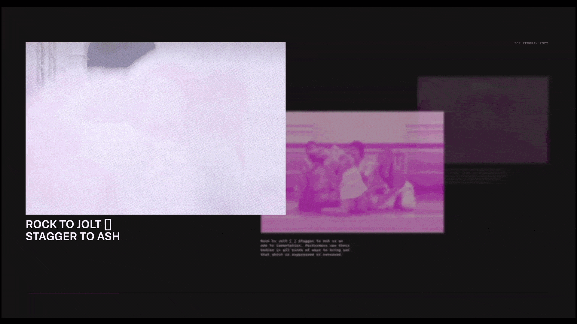
holland festival microsite
This project focuses on the use of experimental art direction and interaction design to create an expressive and functional microsite for the Holland Festival.
overview
Background.
the Holland Festival is the oldest and largest performing arts festival in the Netherlands. Our task was to create an art direction to express the unique features and shows the festival showcases and show this in an encapsulating microsite to sell tickets.
Objective.
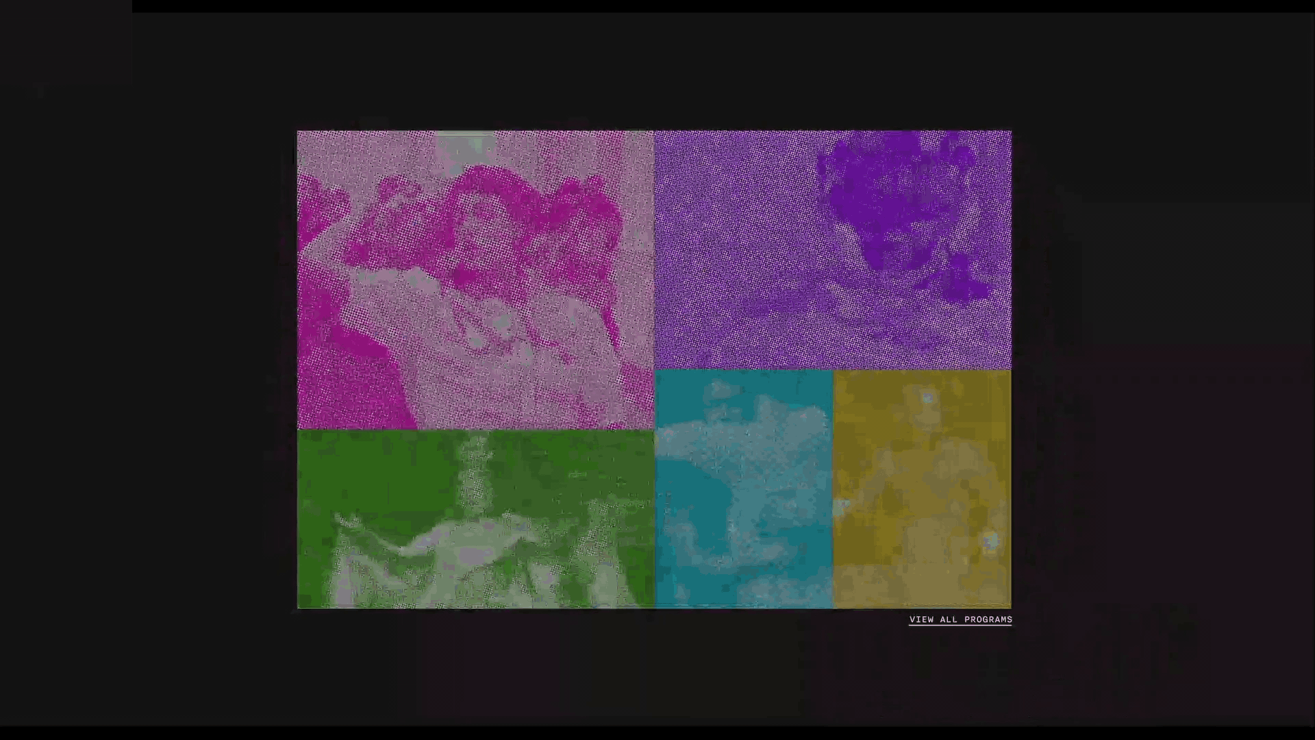
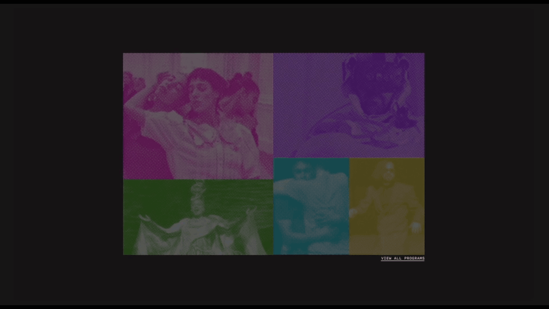
The microsites purpose is to showcase the 5 different art programs of the festival and draw in viewers to attend these engaging and enchanting shows.
Arrive.
home page animation that invites users to commence their exploration of the available programs.

Discover.
Discover a program by hovering over an image, shifting the others aside to encourage interaction and provide more details.

Resolve.
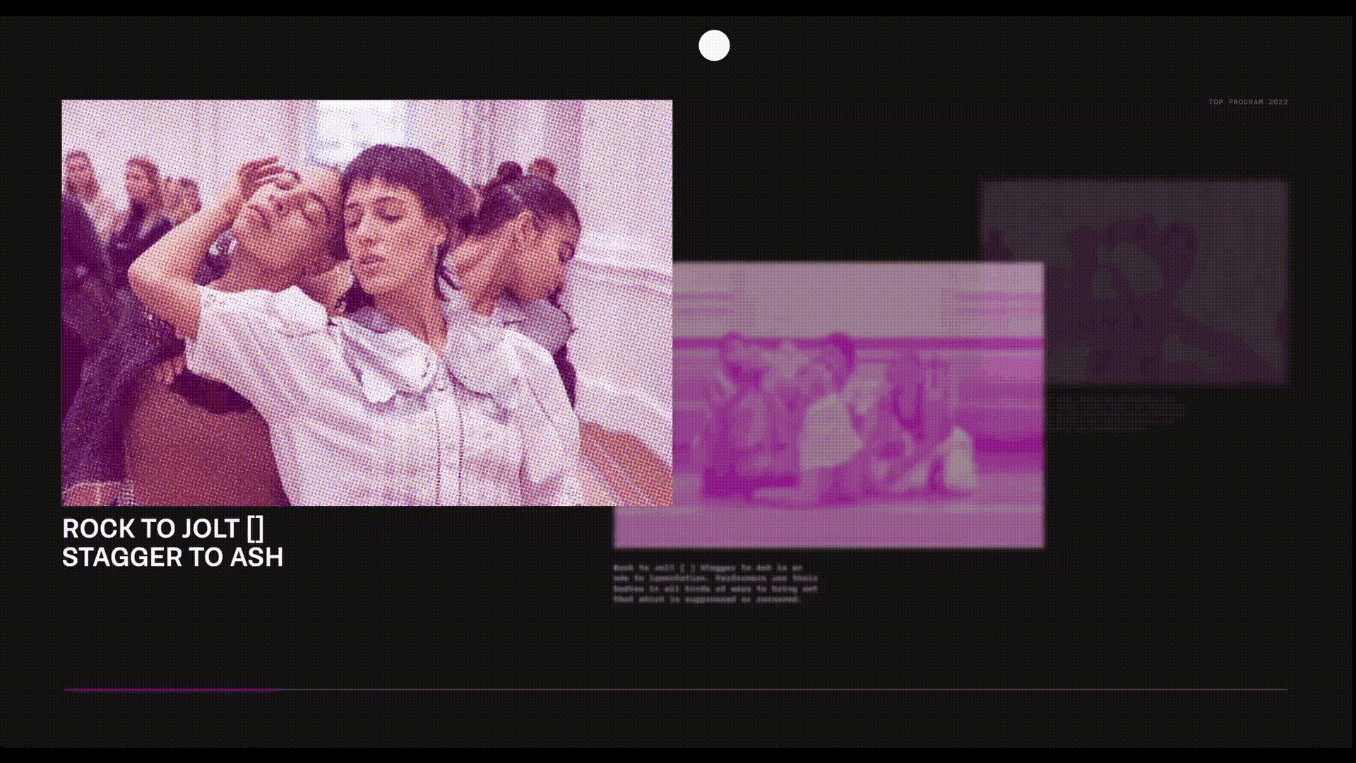
Scroll through exhibition information highlighting previews, show times, and cast, prompting purchase of tickets.

Creating an Identity.
Purpose. Boundries. Artistry. Typeface.
To immerse visitors in the festival’s vibrant atmosphere, i aimed to create a dynamic, discovery-driven design and a bold color palette. Using Brenner Sans for its Dutch roots honouring the festuval and Nitti for versatility, the typography enhances the engaging experience.

Blocking and partitioning information, indicating new ideas

Spatial tension to encourage deciphering of content

Using shape language to create content


100+ poster iterations later...

Graphic to Website Translation.
Once the posters were developed, one was selected to be transformed into a microsite for online ticket purchasing, advertising, and generating excitement for the event. The goal was to not only represent the marketing aspect of the event but also to test the design's flexibility for multidisciplinary use. To determine the best fit, I created mockups of each poster in various ratios, sizes, and additional formats to evaluate which one would work most effectively for the transition.


Expression vs. Functionality Challenge.
Given the festival's vibrant energy, we decided to transform the fifth poster into a microsite to showcase the festival's programs and encourage ticket sales, leveraging its flexibility and dynamic potential within a web environment. However, we encountered challenges in striking the right balance between abstraction and ensuring that essential information was communicated clearly.

Three visual directions were explored for the poster, ranging from functional to highly expressive, allowing us to broaden our creative scope and avoid limitations. The goal was to strike a balance between the expressive visuals reflecting the festival’s dynamic nature and a functional, content-driven approach. Ultimately, the middle direction was selected and refined to achieve this balance effectively.


We prioritized unconventional interaction methods to create a sense of abstraction and uniqueness. We also incorporated halftone imagery to enhance coherence, mystery, and the discovery of information through hover states, fostering a sense of intrigue and user accomplishment.
The website was designed with a gamified experience in mind. However, the information itself was never obscured to prevent ambiguity, ensuring a clear and intuitive flow of understanding.
Microsite Walkthrough.
Introduction animation to explore the 5 available programs
Colour coordination of events & interactive blinking images
Hovering enlarges the image, revealing the exhibition title
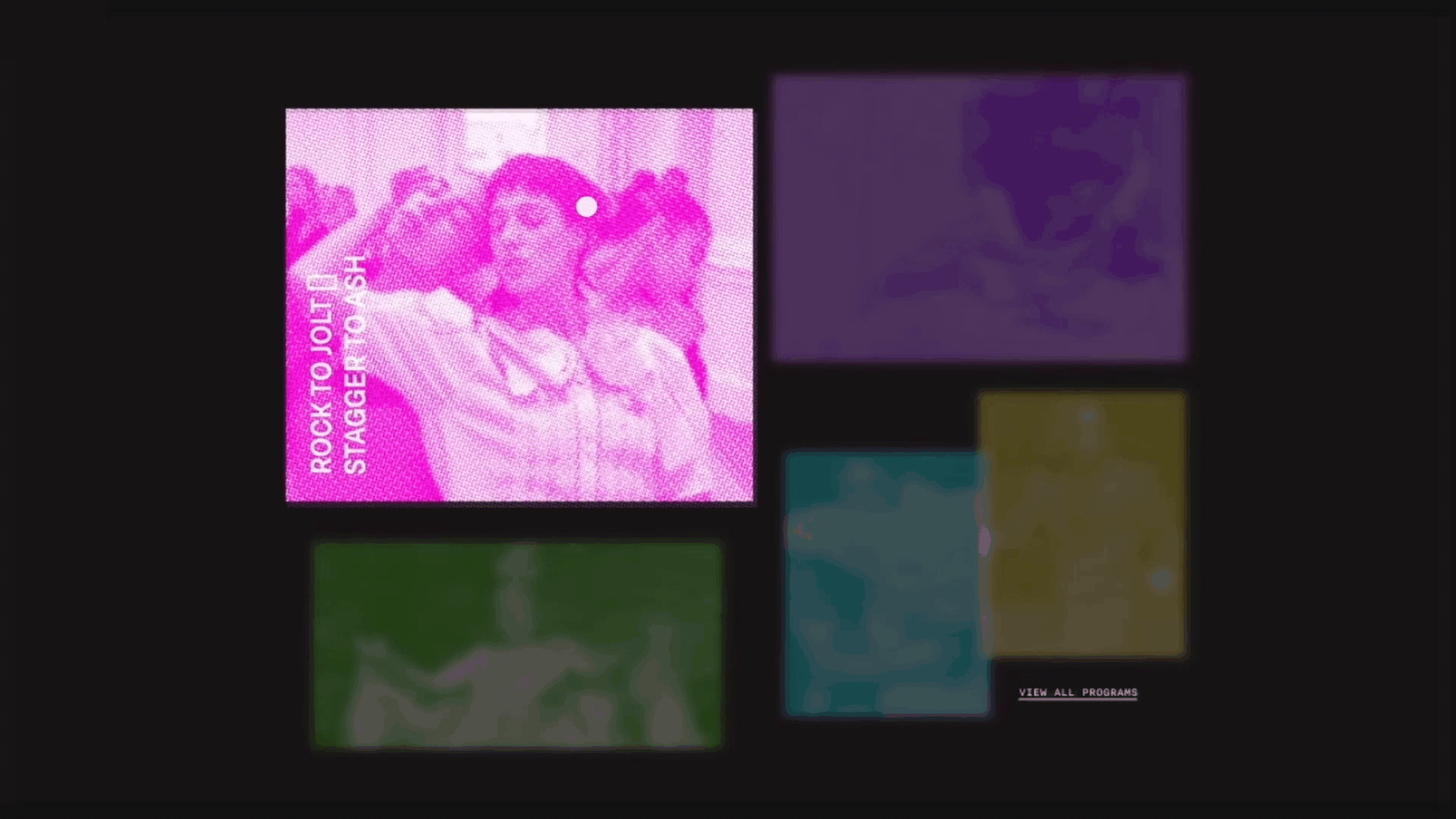
Clicking an image triggers animation, revealing details
A blinking image triggers a video preview on hover
As users scroll, new info appears, with dimmed content for depth and emphasis.
Hovering the right corner turns the cursor into an arrow, prompting exploration of the next exhibition.
Take-a-ways.
The final product showcases my work in creating high-fidelity mockups to replicate the website’s user experience, enhancing my skills in design, typography, and interaction. A key challenge was mastering Figma for interaction design and selecting the right programs, such as Adobe After Effects, for prototype simulations to best represent my vision.
Given another chance, I’d focus on adding more content and improving interaction clarity, especially with the unconventional controls.