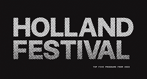
HOLLAND FESTIVAL
EXPRESSIVE MICROSITE SHOWCASING THE PERFORMING ARTS PROGRAMS OF 2022

01
overview & objective
This project focuses on the use of experimental art direction and interaction design to create an expressive and functional microsite for the Holland Festival - the oldest and largest performing arts festival in the Netherlands. The microsites purpose is to showcase the 5 different art programs of the festival and draw in viewers to attend these engaging and enchanting shows.
Disclaimer: the Holland Festival was not a real, paying client. This project was pursued only as a school study.
BACKGROUND
-
Two-week, school project from November to December 2022
TEAM
-
Emma
-
Yuki
-
Stephanie
-
Eunice
SOFTWARE
-
Figma
-
Adobe After Effects
-
Adobe Photoshop
MY ROLES
-
Designed high-fidelity mockups and prototypes
-
Art Direction
-
Copywriting
-
Interaction Research
-
Visual Design
02
the user journey
FIRST IMPRESSIONS
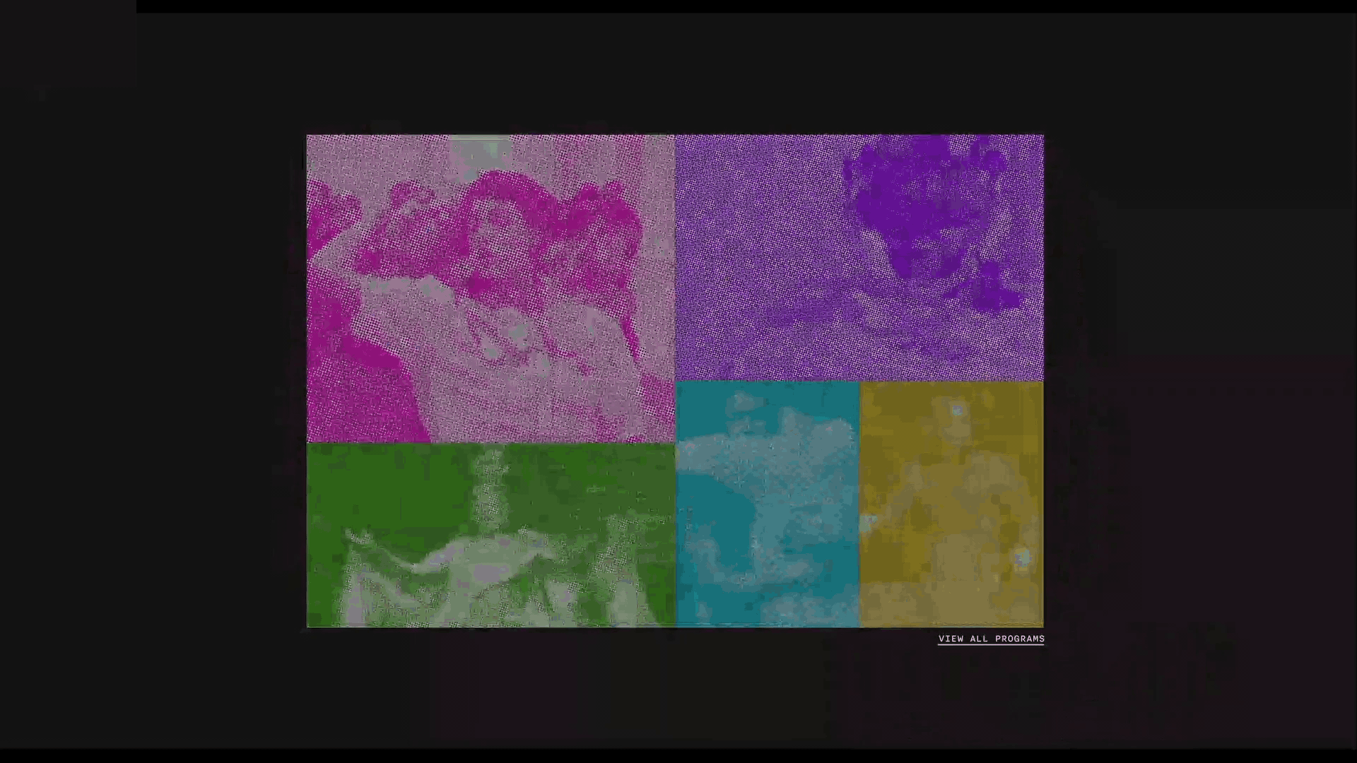
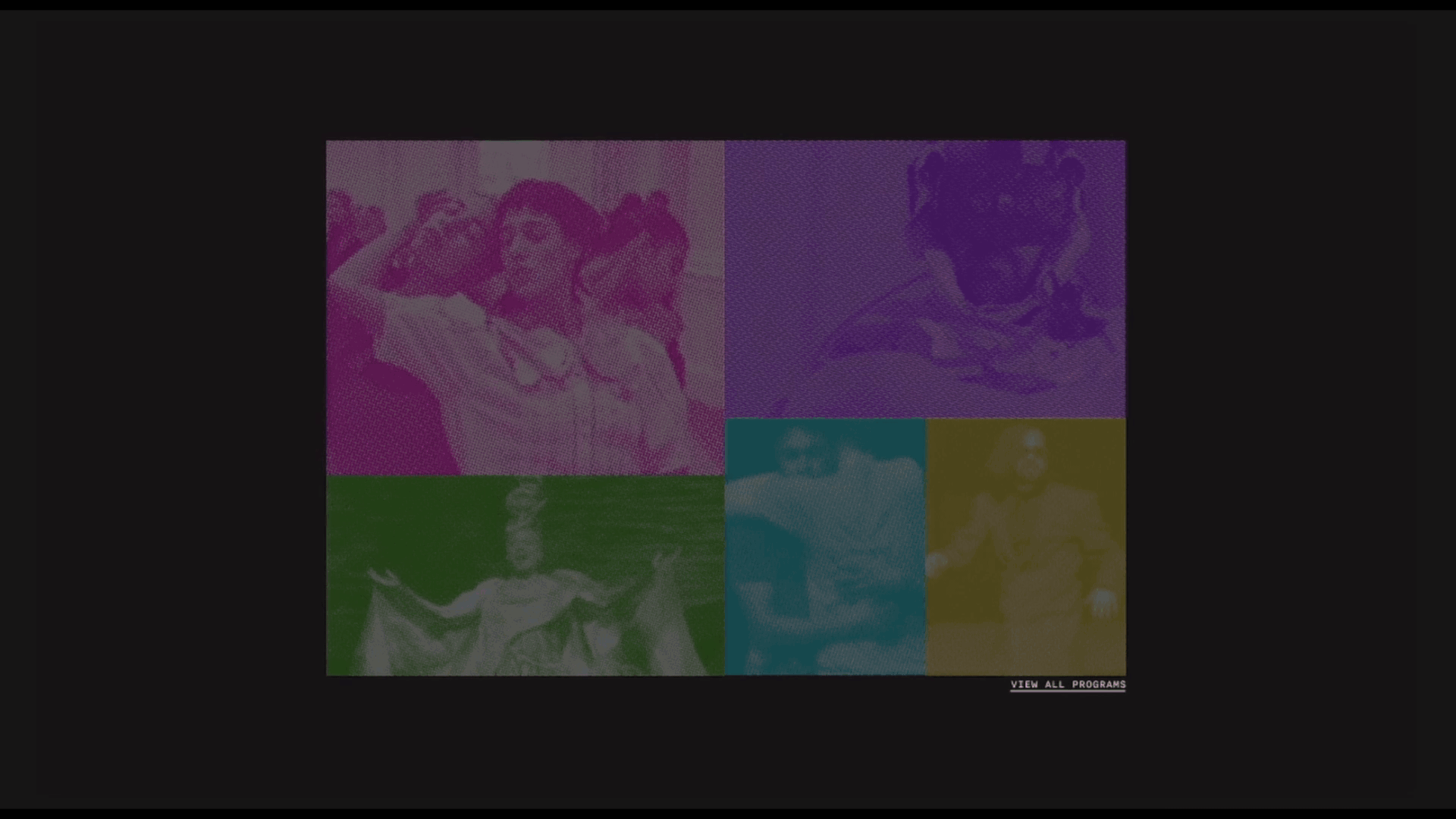
Immersive opening home page animation that invites users to commence their exploration of the available programs.

SELECTING A PROGRAM
By hovering over an image, it enlarges, displacing the others and revealing the exhibition's name, prompting users to click for more detailed information about the show.

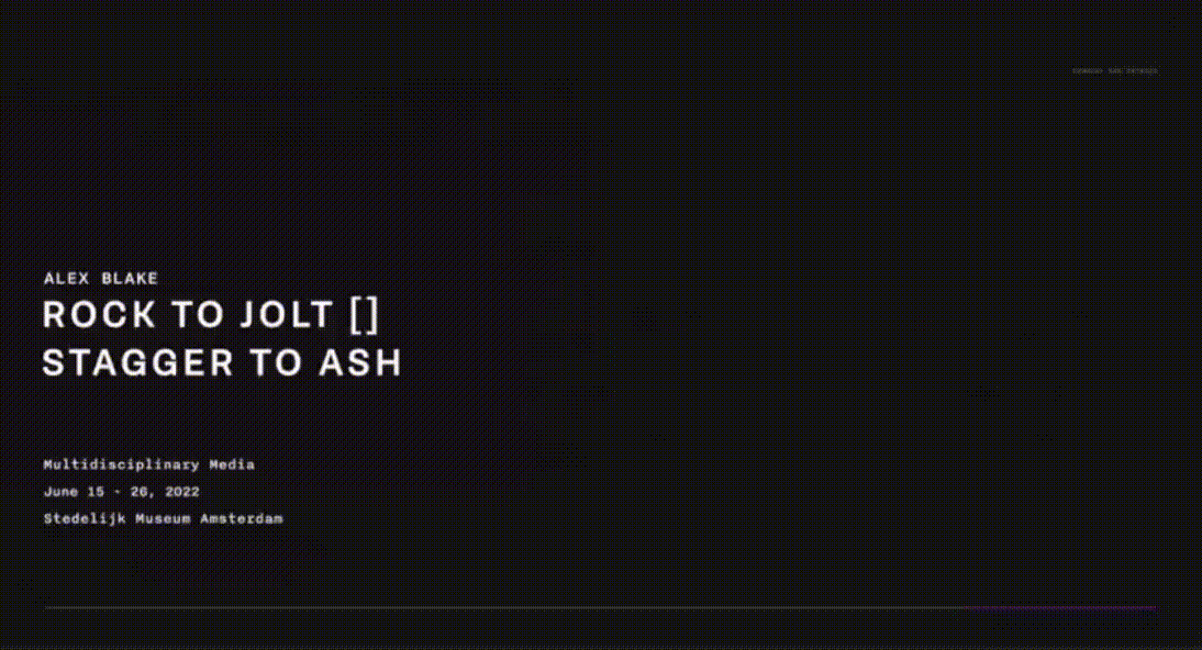
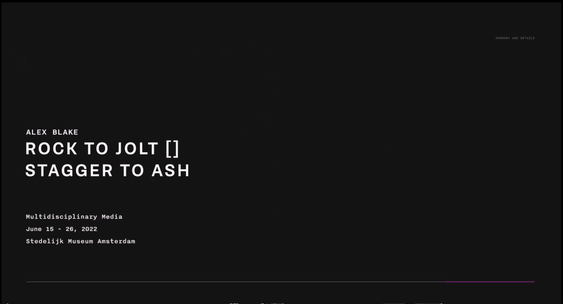
EXHIBITION PAGE
By scrolling through the exhibition page, users can access exhibition information highlighting essential details with hopes of igniting interest to attend the festival.
Arrive -> Discover -> Resolve
03
content strategy & visual identity
PURPOSE
IDENTITY
TYPE
The microsite's primary goal is to immerse users in a rich, interactive, and informative experience, fostering a deep appreciation for the stories behind each exhibition and bring an excited audience to the festival. The microsite also serves as an enduring archive for the future.
The festival itself is a vibrant celebration of diverse cultures and fresh experiences for its visitors. To capture this vivacity, we infused the website with a dynamic and saturated color palette, which not only mirrors the festival's excitement but also acts as a guiding element. Each exhibition is associated with a specific color, aiding in effortless categorization.
In keeping with the festival's Dutch cultural roots, we opted for Brenner Sans as the primary typeface. Its distinctive style pays homage to the cultural origins. To introduce contrast and accommodate the irregularities, we complemented it with Nitti, a font with a more structured and versatile form.
04
art direction
Our final design was shaped by studying the works of ELLEN LUPTON and WIM CROUWEL. This was to discover new design approaches and push the limits of our creativity to produce a unique solution to help the Holland Festival stand out and remain memorable. Through this analysis, we explored the design qualities and principles that appealed to us, informing our decisions and artistic direction. View how they are implemented in 05.
PRINCIPALS
Usage of lines and shapes to organize content
Spatial tension to invite a closer look at content
QUALITIES
Transparency to create hierarchy and depth
Grouping shapes and type to create larger entities
Contrasting textures in images to create dimension (image treatment)
05
microsite walkthrough & interactions
mockups done using Adobe After Effects and Figma
landing page
(OPENING pt 1)
ANIMATION
The user opens the website to an attention grabbing animation that not only introduces the users to the name of the festival but pulls them into an interactive environment where they can view the 5 different programs.
landing page
(OPENING pt 2)
BLINKING SIGNIFIER
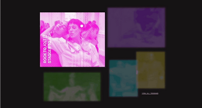
The different exhibitions are organized using shapes and colour. Each exhibition has a designated colour assigned to it. The images start at a low opacity and periodically blink to indicate to the user these elements are interactable and creates intriugue, encouraging users to stay on the site.
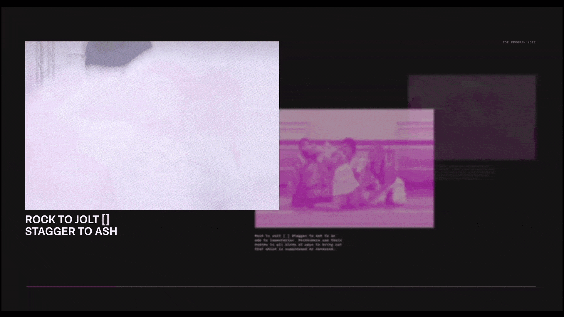
exhibition selection
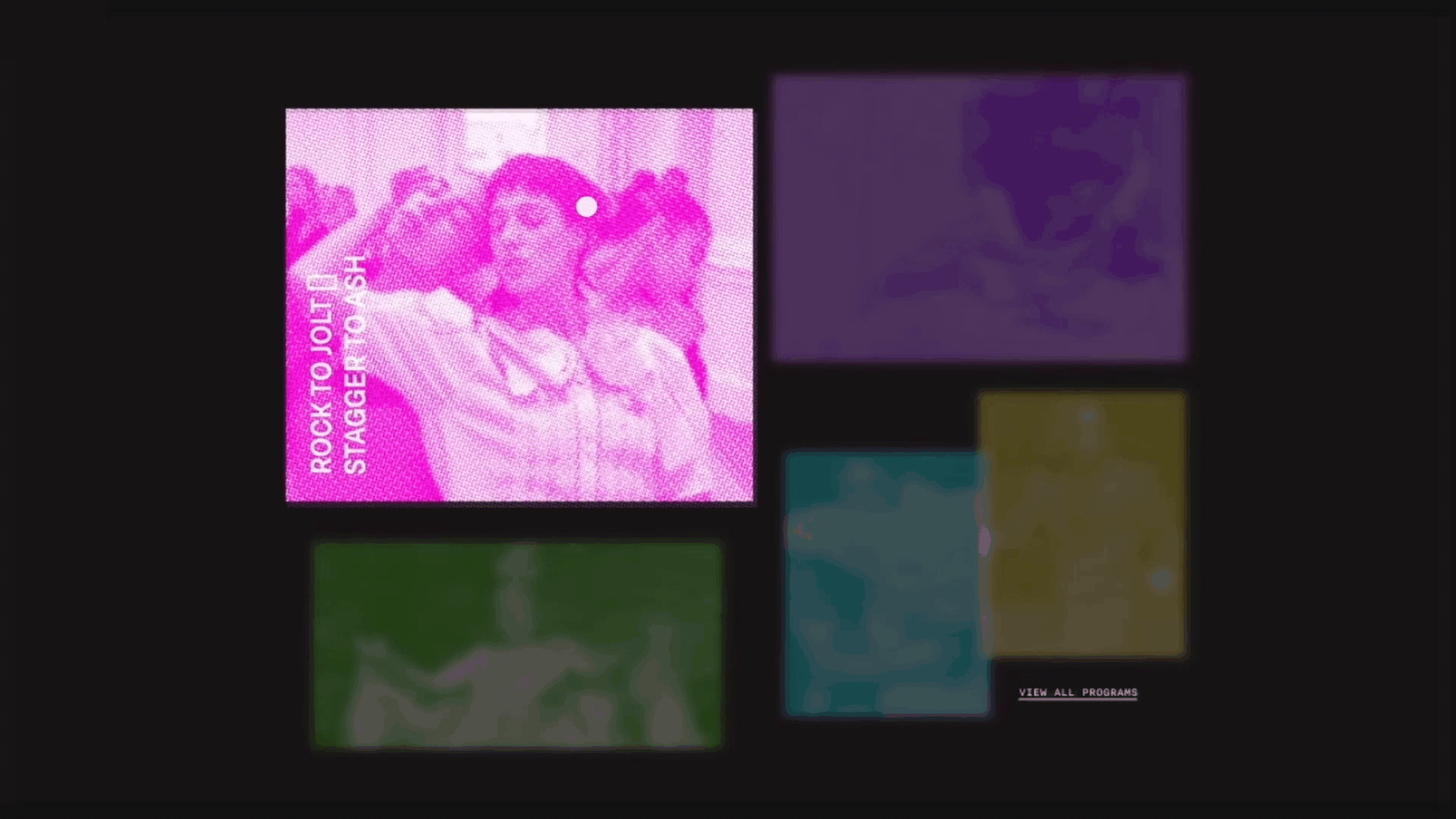
MOUSE HOVER
CAST BACK & FLOATING ANIMATION
CUSTOM CIRCLE CURSER
Hovering over an image causes it to enlarge, becoming more pronounced while simultaneously displacing other page elements. The exhibition title is then presented.
This deliberate action effectively isolates and spotlights the exhibition of the user's interest and captures their attention. As a result, the rigid grid structure gives way, infusing the interface with a sense of dynamic motion.
home to exhibition
MOUSE CLICK TO PROMPT ANIMATION
Upon clicking the image, the user will be guided to the exhibition page. This action initiates an engaging animation, gently displacing other exhibitions to create space and present the user with the detailed exhibition information.
NOTE: Rectangles serve as a unifying visual element throughout the site, reinforced by the block-like transitions, ensuring a cohesive and consistent design language.
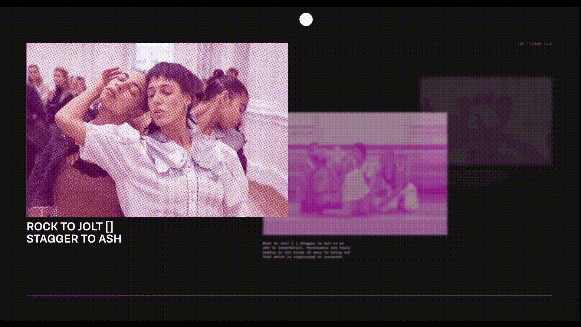
the exhibition
MOUSE HOVER TO CUE VIDEO
Users are initially greeted with an interactive element— an animated image that blinks to signal its interactivity. Upon engaging with this element by hovering their mouse over it, a video presentation is triggered, providing users with an immersive preview of the selected exhibition. This video serves as a valuable tool to offer users a clearer understanding of the exhibition's nature, helping them form more accurate expectations.
To maintain coherence and visual appeal, the halftone is carried over from the image to the video.
explore and discover
MOUSE SCROLL TO UNCOVER NEW INFORMATION
RESPONSIVE TIMELINE AT BOTTOM
Information is presented one section at a time, enhancing the users visibility and comprehension of the content. Already seen or to be seen information is rendered with lower transparency and visibility, establishing depth and hierarchy to what information is important. All these design details contribute to the users comprehension of information.
continued exploration
MOUSE HOVER - PROMPT NEXT EXHIBITION
MOUSE CLICK - BEGIN ANIMATION
MOUSE CHANGES SHAPE - INDICATE INTERACTIBILITY
When the cursor hovers on the far right corner at the end of the current exhibition, it will become an arrow to indicate further exploration. This seamless loop of information allows the user to explore and be further convinced to attend the festival.
06
creative process

week 1-3
We conducted research on Wim Crouwel, extracting design qualities from his work and deriving principles from Ellen Lupton. These insights were then applied to create experimental posters to guide our art direction.

week 4
One poster from the previous week was pursued and developed into a microsite. Various website layouts and interactions were explored, leaving three final microsites ranging from functional to expressive.
week 5
After deciding on one of the website layouts, the team decided to go in a highly expressive line of design, to provide users with a fun and unique experience. At the end of the 5 week graphic experimental process, we finalized the website as seen in 05.
07
takeaways & challenges
“never design in your head”
“iterate, iterate, iterate”
The final outcome of the project demonstrates my most recent work creating high fidelity mockups to replicate the user experience on the website. This process improved my understanding of meaningful design, typography, and user interaction. One notable challenge was mastering interaction design on Figma and determining the best tool, such as Adobe After Effects, for creating certain simulations. We overcame this challenge through effective communication within our team and leveraging each team member's strengths for persuasion.
Furthermore, our group underwent more than 100 iterations of original poster designs and made numerous adjustments to the final website to reach its current state. This required perseverance and teamwork, but the results were worth it. If given the opportunity to redo the project, I would focus on adding more content and enhancing the clarity of interactions, considering the unconventional controls in this expressive website design.